Motorways are about getting from A to B in the quickest - legal - possible time. But have you ever spared a thought for the signs dotted along Britain's roads (and New Zealand roads for that matter)? Britain's road signs look as they do because of Jock Kinneir and Margaret Calvert. The graphic designers standardised the road network, created many of its signs and produced two new typefaces, Transport and Motorway.
In the 1950s, road signs were a mess - a confusing and dangerous hotch potch of different symbols, colours and lettering. But more and more people were acquiring cars.
As the government set about creating a brave new world of motorways, Kinneir and Calvert were given the job of making signs that could be clearly read in a split second.
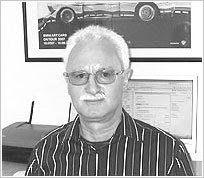
Calvert, now 75, says they had to start from scratch. "It required completely radical thinking. The information wasn't there in terms of reading distance, clarity and letter spaces. We had to make up the signs and then test them. It was instinctive."
They were tested in an underground car park and in London's Hyde Park, where they were propped up against trees to determine the most effective background colours and reading distances.
One of their biggest decisions, which caused upset among conservative commentators at the time, was to opt for a combination of upper and lower case letters.
"The actual word shape was the most distinctive thing because if you had Birmingham in capitals, from a distance, it's difficult to read but in caps and lower case you have word shape," says Calvert. "That was fundamental."
After the success of their big and bold motorway signs, the pair were commissioned in 1963 to overhaul the rest of Britain's roads. They created new signs and remodelled existing ones, based on the European protocol of triangular signs to warn, circles for commands and rectangles for information.
In the 1950s, road signs were a mess - a confusing and dangerous hotch potch of different symbols, colours and lettering. But more and more people were acquiring cars.
As the government set about creating a brave new world of motorways, Kinneir and Calvert were given the job of making signs that could be clearly read in a split second.
Calvert, now 75, says they had to start from scratch. "It required completely radical thinking. The information wasn't there in terms of reading distance, clarity and letter spaces. We had to make up the signs and then test them. It was instinctive."
They were tested in an underground car park and in London's Hyde Park, where they were propped up against trees to determine the most effective background colours and reading distances.
One of their biggest decisions, which caused upset among conservative commentators at the time, was to opt for a combination of upper and lower case letters.
"The actual word shape was the most distinctive thing because if you had Birmingham in capitals, from a distance, it's difficult to read but in caps and lower case you have word shape," says Calvert. "That was fundamental."
After the success of their big and bold motorway signs, the pair were commissioned in 1963 to overhaul the rest of Britain's roads. They created new signs and remodelled existing ones, based on the European protocol of triangular signs to warn, circles for commands and rectangles for information.